Overview
Subcycle is a subscription management tool for users to keep track and manage recurring payments. To improve accessibility, expand market reach, and enhance user experience, Subcycle is creating a mobile version to complement their web platform.
Objective
As the web version gradually loses users, Subcycle needs to design an end-to-end IOS mobile experience within Design Thinking framework to retain current user base and expand market reach by allowing:
1. Current users to see all subscriptions in one place.
2. Returning users to unsubscribe unwanted services.
3. All users to receive notification when a recurring payment is about to auto-renew.
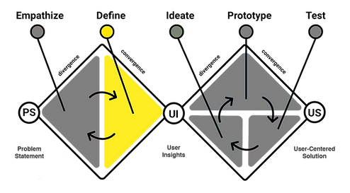
Five Stage of Design Thinking

Empathize
Researching right questions with regard to customers' relationships toward their subscriptions.

Secondary Research:

51% of Americans say they have unwanted subscriptions

57% of Americans visit mobile device, 43% visit desktops and tablets

71% of Americans wasted over $50 a month on unwanted charges
-
How do we know if managing subscriptions is an issue for users?
-
What do they need to better managing subscriptions?
-
Why should we build a mobile app?
"Subscription #FOMO is a real phenomenon...people who hold onto unused gym memberships, for example, might avoid canceling because it feels like giving up on their fitness..."
Competitor Analysis:
I have conducted heuristic analysis and investigated the pros and cons of three potential competitors.
Heuristics
System status visibility
User control and freedom
Error Prevention
Flexibility and Efficiency of use
Aesthetics and minimalistic design

Truebill

Mint

Bobby
Exceptional
On Point
Problematic
Features
Desktop Version
Mobile Version
See all Subscriptions
Get Notified
Automatically unsubscribe
Linking Bank
Minimal
Yes
Yes
Yes
Only in Premium Version
Must Link Banks
Comprehensive
Yes
Yes
Yes
No
Must Link Banks
No
Yes
Yes
Yes
No
Only Manual Entry
Truebill
Mint
Bobby
Findings:
-
Some users prefer to share bank information while others are ok with manually adding subscriptions.
-
Unsubscribing from a service might trigger fear of missing out among users.
-
The design process must take services that come in different billing cycle, currency types, and policies into account.
-
Users might only want to suspend a service until a further date to resume its service.
Define
I synthesized my findings into actionable insights by creating an empathy map and a persona.
Empathy Map:

Persona:

Ideate
Then I finalized the style guide with a focus on conveying the brand image of warmth, welcome, and elegance.
After coming up with potential solutions to each business goals in several key wireframes, I conducted initial testing on the Low-Fi wireframes and refined the design.
Styleguide:


Key Wireframes:
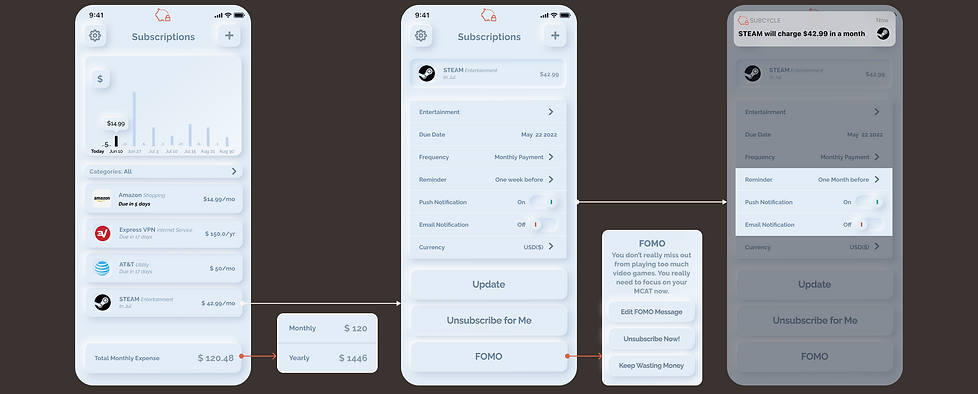
1. See all subscriptions
2. Unsubscribing
3. Notification
-
Frame 1 allows all current users to see all subscriptions in one place.
-
Frame 2 allows returning users to unsubscribe unwanted services.
-
Frame 3 allows all users to receive notification before a recurring payment is about to auto-renew.

Prototype and Test
I have conducted two rounds of moderated usability test with 5 participants per round. In the second round of test with iterated prototype, users achieved a 95% of success rate of the following tasks:
Feedback on the Main Interface:
“I feel like everything on the screen is important and I don’t know where to focus on.”
“What if I have five bank accounts but I only want to monitor subscriptions within one or two accounts?”
“I am having difficulty in how the bar graph works.”


-
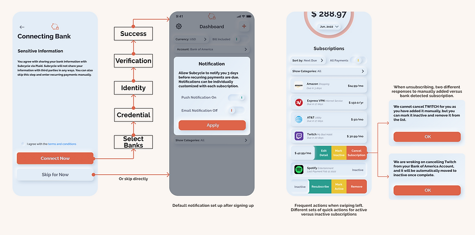
Complete sign up and adding bank accounts
-
Adding subscription manually.
-
Unsubscribing through quick action
-
Modify all subscriptions through various sorting filters.
Feedback on Accessibility
“Can I not link my bank account because I don’t trust third party fin-tech app?”
“I can’t figure out how to find and set up notifications.”
“Can I cancel it more quickly if I am in a hurry before the charging date?”
Feedback on Adding Subscriptions
“I want to see the amount of clearly when adding subscription.”
“What if I opened another bank account and linked several subscriptions with it?”

Final Product


Clickable Prototype:
Retrospective
Reflection
-
Through out the research, I got to know how UX in Fintech has quite many predefined features such as the 'number screen' linked with account amount.
The Next Step
-
If I have an extended deadline, I would study the possibility of introducing other basic personal finance features such as spending tracking and saving tips.
-
Designing a Fintech screen is much more methodical and logical compare to the relatively artistic approach to UX in lifestyle or e-commerce apps.
-
Explore the possibility of having a premium service flow where the app automatically track how often users use certain subscription, whether once a week or a month, to give users better idea if they should cancel certain services.